On Presenting
Ever see Steve Jobs do his MacWorld keynotes? That’s the bar. Aim for that.
- Your slides are your bullet points, not your transcript.
- Slides are visual aids. Not literary works.
- Have a separate set of notes that supplement the slides if you need more words.
- Don’t read the slides, talk about them.
- Look at your audience & talk to and with them.
Tools, Type, Tips.
- Use what you know, provided you can make your slides look at good as you can possibly make them.
- Use clear legible type. Helvetica. Open Sans.
- Simple color scheme with sufficient contrast (There’s a reason Steve Jobs used white text on really really dark backgrounds).
- Able to be read anywhere in the room.
- Use a clicker, a wireless mouse, a bluetooth touchpad – something that lets you stand where you can connect with the audience.
- Keynote, PowerPoint – these are fine. If you’re a WordPress developer, why not WordPress?
I had to do some WordPress training for a business publication. After trying Prezi, Open Office, Keynote and PowerPoint, I asked myself why I was doing this the hard way – couldn’t I just build something in WordPress? The answer was definitely yes. I wrote a theme that uses Flexslider to accomplish this. Others have written presentations for WordCamps that use different jQuery plugins.
You can also code your own! Just don’t veer into the weeds & lose site of your aim, which is to make an effective presentation.
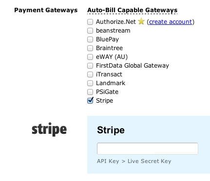
Freshbooks works with Stripe now?

Better mobile detection with wp_is_mobile() and Mobble
WordPress 3.4 is more “mobile-friendly” with the introduction of a new function: wp_is_mobile(). This function checks for a mobile user agent. Another way to say it is that the function checks to see if the browser you’re using to visite the site is on a mobile device. It looks for a blanket “Mobile” user agent, as well as specific ones: “Android”, “Silk”, “Kindle”, “BlackBerry”, and “Opera Mini”. This covers iPads, Android tablets, iPhones, Blackberries, Android phones, and more. The function only returns TRUE or FALSE. That’s it. You can use this like a conditional template tag to test for the presence of a mobile device.
How would you use this?
If you wanted to deliver (or not deliver) parts of your template conditionally, based on the presence of a mobile device, you could use wp_is_mobile() to make this happen. Note in the code below that you can test for the negative, as well. This could be useful when you need to specify content delivered for each condition.
Where would this go?
That depends on why you’re using it. Think of this as a conditional tag. Let’s say you have a site that uses Twenty Eleven as its theme. You want the search field in the header for non-mobile visitors, but for mobile visitors, you don’t want it up there. We’ll start in the header.php file in the twentyeleven directory (in wp-content/themes).
Look for this line of code: <?php get_search_form(); ?> (It should be around line 125.)
Edit that line to look like this:
Now the search form will only load in the header if the conditional is false. In other words, when the visitor to the site is on a non-mobile (desktop) browser.
You could use this to restructure your code in order to deliver more optimal content based on the browser. I did this recently for a client’s site. We wanted to move the main nav and change the behavior & appearance of the background based on what type of browser was being used:
Taking it further
On the above example, I showed a mobile phone view and a non-mobile view. What happens when you want to target tablets separate from phones? Mobble is a nice plugin that helps you do just that. Mobble gives you multiple conditionals. These are just four of them:
is_handheld(); // any handheld device (phone, tablet, Nintendo)
 is_mobile(); // any type of mobile phone (iPhone, Android, Nokia etc)
 is_tablet(); // any tablet device (currently iPad, Galaxy Tab)
 is_ios(); // any Apple device (iPhone, iPad, iPod)
Now you can use Mobble’s is_mobile() conditional and target just phones, or is_tablet() to target just tablets, etc.
LESS & WordPress – notes
Use LESS to build style.less.
style.min.css is mostly a doc-block with an @import bringing in the less.css file.
in functions.php, write a universal body class of the client name. In a group work environment, this could be multiple names.
last, in the style.min.css, @import the client.css where the client is told to place all their custom styles prepended with the custom body class.
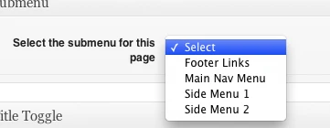
Mashed up WordPress Nav Menus & Custom Meta Boxes
Genesis Accordion plugin
Update: I’m working on a new release of this plugin that lets you choose either a horizontal accordion or a vertical one. I’ll release it on the WordPress plugins repository once I’ve got it finished.
If you would like to test a beta of the new version, you can download it here. I’d appreciate any feedback you have. The admin is still rough & needs some more attention. The basics are working, though.
Interested in testing a Genesis plugin for WordPress? I had a client who wanted an accordion plugin (think Slide Deck) on their site. More than just sliding images around, it would have to draw from content: Posts, Pages, etc. A quick search of the Web led me to jQuery Easy Accordion. We’re in business.
I use Genesis for the WordPress themes I build. The good folks at StudioPress built a great slider plugin so it was a no-brainer to use that as my starting point. Rip out the javascript & replace that with jQuery Easy Accordion. Rename things so as not to conflict with Genesis Slider (should someone use both on their site). Build in new configuration options. Create the .pot file for translations. It’s a plugin!
You can download Genesis Accordion here.
Genesis Accordion requires you to be using the Genesis framework. Without that, this plugin won’t work.
You can set whether or not the accordion auto-starts. You can select which post type you want it to draw from, what category, etc. Each slide in the accordion has the slide title running vertically up the edge of the slide. By default, this is also the title of the Post / Page. Since these titles can run longer than the space on the edge of the slide allows, you can opt to either truncate the titles to a specific number of characters or you can create a custom field called Accordion Title & use that.
Download it & give it a shot. Leave a comment & let me know how it works, problems, conflicts, etc. It’s a relatively quick & dirt release, mostly a proof-of-concept. I make no guarantees with it, though I did test in on WP 3.3.1 with various other plugins enabled.
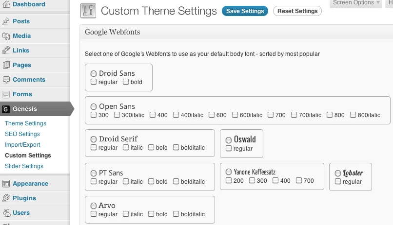
Fun with Google Webfonts API, Genesis and WordPress

Vimeo and Youtube iframe shortcodes
I like how WordPress automatically coverts a Youtube url into a video embed, but I’m not really happy with the use of the embed tag. I like the newer iframe methods Youtube and Vimeo both use and I wanted a way to easily drop those into a Post or Page.
So I wrote two shortcodes to do this, one for Youtube and one for Vimeo.
Youtube shortcode
Start with the address (URL) of a Youtube video. For instance, say you’re watching this Youtube video: http://www.youtube.com/watch?v=aBnGbFjlhM0&feature=grec_index. You would copy everything from the left up to the ampersand (this-> &): http://www.youtube.com/watch?v=3s4Czla6tXc.
This becomes the src attribute of your shortcode and you write this in your Post or Page:
[ youtube src=http://www.youtube.com/watch?v=3s4Czla6tXc ]
If you want to add a width and height attribute, you can add width and height like so:
[ youtube src=http://www.youtube.com/watch?v=3s4Czla6tXc width=600 height=450 ]
Tip: If you click on the Share button underneath the Youtube video, then again on Embed, you’ll see, in the embed code, the width and height of the video you’re watching.
Vimeo shortcode
Vimeo URLs are easier to work with, so far. They look pretty much like this: http://vimeo.com/31082448. Copy the address and it becomes the src attribute of your shortcode. Write it in your Post or Page:
[ vimeo src=http://vimeo.com/31082448 ]
If you want to specify a width and height, you can add those attributes like so:
[ vimeo src=http://vimeo.com/31082448 width=640 height=360 ]
Tip: To get the width and height of a Vimeo video, click on the embed link on the right side of the video player (mouse over the video to see these). Then click on the Customize embed options. Enter a width value and press the Tab key on your keyboard (or click on the height field). Vimeo will automatically calculate the correct height value for you. Use those for your width and height attributes in your shortcode.
Both shortcodes (with uStream support, too):
Fluid Images Plugin
WP Fluid Images runs when you insert an image into a Post or Page. It removes the fixed width and height attributes from the image tag. If you insert an image from the image uploader, by default, a width and height attribute is inserted into the image tag with fixed pixel values. This plugin prevents this from happening, because this can be problematic if your theme is built using responsive design methods. The plugin also adds a style tag in the header that sets a max-width rule of 100%. This insures that any image in a Post or Page won’t extend past the width of the Post or Page.
If you resize an image in the Visual Editor, a new width and height attribute get added to the image. WP Fluid Images loads a jQuery script that examines the .post, or .page divs for image tags. It calculate the image’s width as a percentage of the .post or .page div, removes the width and height attributes, and adds a style attribute with a width value set to the calculated percentage.
What is the concept of “Fluid Images”?
The idea behind fluid images is that instead of having images that size proportionally and smoothly as your web page’s width increases or decreases. Ethan Marcotte wrote an article on the idea at A List Apart:
You can also learn more at his site: Unstoppable Robot Ninjas. Fluid Images is an important consideration in responsive web design. Which segues to:
What is Responsive Web Design?
Responsive Web Design is the idea of having your site’s design be flexible enough to resize based on the width of the browser window. This allows you to create a single, adjustable design that works regardless of the size of the device. It’s a nice alternative to building separate designs for desktop browsing, tablets, mobile browsers, etc.
You can download WP Fluid Images here.


