slash25 code

  • Home
  • Work
  • Code
  • Github
  • WordPress Austin
  • Blog
You are here: Home / Archives for code
August 2, 2012 By Pat · Leave a Comment · (Updated: August 17, 2016)

Better mobile detection with wp_is_mobile() and Mobble

August 2, 2012 by Pat

WordPress 3.4 is more “mobile-friendly” with the introduction of a new function: wp_is_mobile(). This function checks for a mobile user agent. Another way to say it is that the function checks to see if the browser you’re using to visite the site is on a mobile device. It looks for a blanket “Mobile” user agent, as well as specific ones: “Android”, “Silk”, “Kindle”, “BlackBerry”, and “Opera Mini”. This covers iPads, Android tablets, iPhones, Blackberries, Android phones, and more. The function only returns TRUE or FALSE. That’s it. You can use this like a conditional template tag to test for the presence of a mobile device.

How would you use this?

If you wanted to deliver (or not deliver) parts of your template conditionally, based on the presence of a mobile device, you could use wp_is_mobile() to make this happen. Note in the code below that you can test for the negative, as well. This could be useful when you need to specify content delivered for each condition.

Where would this go?

That depends on why you’re using it. Think of this as a conditional tag. Let’s say you have a site that uses Twenty Eleven as its theme. You want the search field in the header for non-mobile visitors, but for mobile visitors, you don’t want it up there. We’ll start in the header.php file in the twentyeleven directory (in wp-content/themes).

Look for this line of code: <?php get_search_form(); ?> (It should be around line 125.)

Edit that line to look like this:

Now the search form will only load in the header if the conditional is false. In other words, when the visitor to the site is on a non-mobile (desktop) browser.

You could use this to restructure your code in order to deliver more optimal content based on the browser. I did this recently for a client’s site. We wanted to move the main nav and change the behavior & appearance of the background based on what type of browser was being used:

Desktop view

Kimbia Racing's site as seen on an iPhone

iPhone view of the same theme.

Taking it further

On the above example, I showed a mobile phone view and a non-mobile view. What happens when you want to target tablets separate from phones? Mobble is a nice plugin that helps you do just that. Mobble gives you multiple conditionals. These are just four of them:

is_handheld(); // any handheld device (phone, tablet, Nintendo)
 is_mobile(); // any type of mobile phone (iPhone, Android, Nokia etc)
 is_tablet(); // any tablet device (currently iPad, Galaxy Tab)
 is_ios(); // any Apple device (iPhone, iPad, iPod) 

Now you can use Mobble’s is_mobile() conditional and target just phones, or is_tablet() to target just tablets, etc.

Tagged With: code, mobile

March 15, 2012 By Pat · Leave a Comment · (Updated: August 17, 2016)

Mashed up WordPress Nav Menus & Custom Meta Boxes

March 15, 2012 by Pat

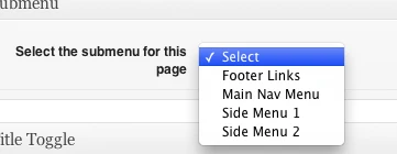
Problem: I needed a meta box for Pages that was dynamically populated by the site’s custom Menus.

Solution: Added this to my CMB metaboxes code:


Tagged With: code, menus, metaboxes

October 31, 2011 By Pat · Leave a Comment · (Updated: August 17, 2016)

Vimeo and Youtube iframe shortcodes

October 31, 2011 by Pat

I like how WordPress automatically coverts a Youtube url into a video embed, but I’m not really happy with the use of the embed tag. I like the newer iframe methods Youtube and Vimeo both use and I wanted a way to easily drop those into a Post or Page.

So I wrote two shortcodes to do this, one for Youtube and one for Vimeo.

Youtube shortcode

Start with the address (URL) of a Youtube video. For instance, say you’re watching this Youtube video: http://www.youtube.com/watch?v=aBnGbFjlhM0&feature=grec_index. You would copy everything from the left up to the ampersand (this-> &): http://www.youtube.com/watch?v=3s4Czla6tXc. 

This becomes the src attribute of your shortcode and you write this in your Post or Page:

[ youtube src=http://www.youtube.com/watch?v=3s4Czla6tXc ]

If you want to add a width and height attribute, you can add width and height like so:

[ youtube src=http://www.youtube.com/watch?v=3s4Czla6tXc width=600 height=450 ]

Tip: If you click on the Share button underneath the Youtube video, then again on Embed, you’ll see, in the embed code, the width and height of the video you’re watching.

Vimeo shortcode

Vimeo URLs are easier to work with, so far. They look pretty much like this: http://vimeo.com/31082448. Copy the address and it becomes the src attribute of your shortcode. Write it in your Post or Page:

[ vimeo src=http://vimeo.com/31082448 ]

If you want to specify a width and height, you can add those attributes like so:

[ vimeo src=http://vimeo.com/31082448 width=640 height=360 ]

Tip: To get the width and height of a Vimeo video, click on the embed link on the right side of the video player (mouse over the video to see these). Then click on the Customize embed options. Enter a width value and press the Tab key on your keyboard (or click on the height field). Vimeo will automatically calculate the correct height value for you. Use those for your width and height attributes in your shortcode.

Both shortcodes (with uStream support, too):

Tagged With: code, shortcodes, video

copyright © 2020 slash25 code | privacy policy | pat on twitter


Loading Comments...